pretty cool. I’m almost done redrawing the zambretti thing.
Cloud you make three pictures for me of your zabretti disk? one with the wind set to S and the pressure to 28", one with the wind set to N and the pressure still at 28", and one with the wind to N and the pressure at 31". Just to make sure I’m doing it right. Even better would be a short video ![]()
Based an the color of the material (in the top 1915 model) it looks as if the code (The red characters in the later model) is printed on the second disk, but than how does it change when the wind direction changes? I would understand if the second disk had three long slids and the code is on the bottom disk. Or phrased differently, if you set the smallest disk to 1000mB (29.5"), and the wind set the dead calm, it shows the Red U for falling pressure. If you keep the barometric pressure the same, and rotate the bottom disk (wind direction) how does the U change, if it is printed on the second disk? My conclusion (possibly out of lack of understanding) is that the red U is printed on the bottom disk. What is it??
On one of my first Zambretti discs. . . .believe it or not. . .the outter disc cracked in two after it fell and hit the carpet! I’d since taped back together. . .but pulled the tape off and separated the outter disc from the first two so you could see how the letters are arranged. Depending on the wind setting and Baro. . .the OUTER letters correspond to Fallling. The MIDDLE row of letters correspond to Rising. . .and the INNER row of letters correspond to Steady.

Here are the 3 images you wanted. . .
- South Wind and Baro of 28.00 inHg (950mb)

- North wind and Baro of 28.00 inHg (950mb)
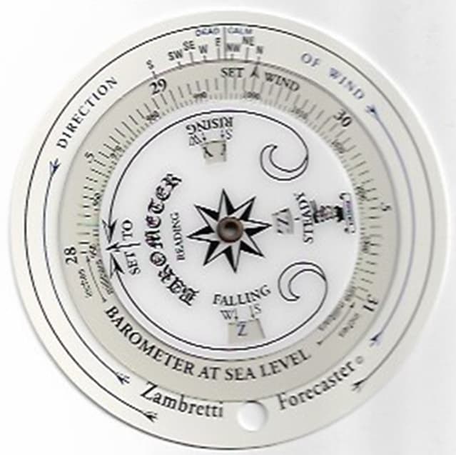
- North wind and Baro of 31.00 inHg (1050mb)

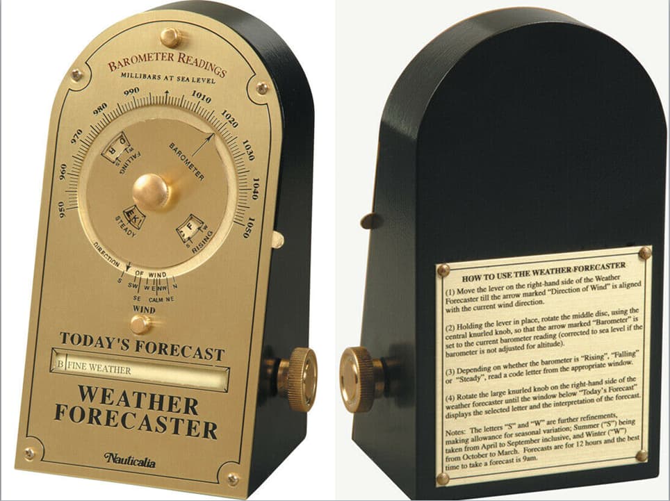
Here’s closer view of front and back of Nauticalia (like mine that I am looking at right now; N wind; Baro=1023.7; Rising . . . Yields A | Settled Fine / B | Fine Weather)
I’m sure the arrangement of letters is identical to the plastic discs. . .all based on Zambretti.
Hope this helps you with your project.
That just great! thanks a lot!! and my brain started working again as I now suspect the second disc is simply made out of transparent material. I’m going to make one out of wood. but that’s no problem. I’ll make it “transparent” by cutting some material away. Perhaps, I’m also making on online version where you have to actually rotate the disks with your mouse. (but that is something I’ll have to learn how to do that)
Thanks again!
(@wweems sorry for hijacking your post)
1 Like
somehow there appear to be code characters that you cannot get to. For example in the last picture of the pocket device, you have set it to the highest pressure, and northern wind, but there appears to be an extra A in the steady window, to the left, which you cannot reach.
Similarly in the first picture, the lowest pressure, wind set the S, but in the Falling window there seems to be an extra Z which you could only reach by setting the pressure even lower. How does this compare to you desktop version? Is it the same in that some code characters can only be reached when using out-of-range pressure values?
Supposedly. . .the season is ‘matched’. . . Summer or Winter. For both the discs and the “Nauticalia” desktop Weather Forecaster. . .when any window (Falling, Steady, Rising) shows TWO letters. . .you simply use that main displayed letter. e.g. I set the deskop item to North wind and the highest Baro at 1050mb. The Falling and Rising windows show A A . . . while Steady shows AA. So the way I use is that the forecast is for A | SETTLED FINE
The wind is kept at North . . .but I rotated the outer dial for pressure to read 1005 mb.
Steady says EK (E | FINE, POSS SHOWERS) and (K | FAIRLY FINE, SHOWERS LIKELY) So I’d have to choose which one which closesly matches what I want to use. For Steady. . .there is NO distinction between Winter or Summer. That distinction is ONLY for Rising or Falling Baro.
Falling has O R . . . but the " O" is to the left side of the window with the arrow for Winter (October - April) pointing to it. The " R " is for Summer (April - October). . .so in this case I’d DISregard the " R " because it’s Not Summer. . . I’d choose the O | SHOWERY, BECOMING LESS SETTLED.
Rising has the letters C F displayed . . .where “C” is for Summer . . . and “F” is for Winter. So with a North Wind and a pressure of 1005 mb in Winter. . .the forecast would closely match F | FAIRLY FINE, IMPROVING.
Basically. . .the letters for the Steady window (inner row of letters). . .they are Closer Together. .
such as NPSWX etc . . . whereas the rows of letters for the middle and outer have a space between them. . .such as A_A_B_B_C_G . In the example I just gave…I used the underscore between the letters to illustrate the space. . . otherwise this Community Forum format would bunch the letters all together.
Similarly in the first picture, the lowest pressure, wind set the S, but in the Falling window there seems to be an extra Z which you could only reach by setting the pressure even lower. ?
In this case. . .if a window displays a letter. . .like you mentioned the “extra Z” above. . .I’d just disregard the other two windows. e.g. if PRESFR (Pressure Falling Rapidly). . .use Falling and disregard what Steady or Rising have. Same goes for PRESRR (Pressure Rising Rapidly) … use whichever pressure tendency is most appropriate for the given situation.
I understand how to read it, that’s not the problem.I just find it very suspicious, that some letters can only be seen, when you set the barometer value lower then 950 or higher then 1050. That worries me a bit, to the point where it might be that the modern version made a mistake while adapting the old layout. Why is this extra Z there, if you can never see it?? That’s why I was wondering if your desktop version has the same extra Z.
Yes, I’ve seen it. . .but really didn’t pay that much attention it. In other words. . . I saw it. . .but didn’t see it! . . . kinda similar to Hearing. . .but not Listening. Not sure how much more help I can provide. This must’ve been something that Zambra & Negretti “designed” initially. . .but in later decades. . .appears to be a “fault” of some sort. The Only other explanation that I can deduce is that they (Zambra & Negretti) had tooo many Z’s at the end of that particular “round” of letters that time later proves were unneeded and should’ve been left blank. A Baro of greater than 1050 mb (31.01 inHg) would indicate an eXtremely COLD Northern Hemisphere High Pressure System. . . and a Baro less than 950 mb (28.05 inHg) would indicate some sort of catastrophic Tropical entity. Back in 1915. . they probably didn’t (wouldn’t have) imagined such Meteorological Extremes. . .which appear to be “common place” here in the 21 Century!
My main question is, is it the same on your desk version? If the desk version is different, it might indicate an error was made.

I wouldn’t want to dismantle the device. . .so here are some cell fone camera images. The surface of Nauticalia is a polished brass and is Highly Reflective of light!
First one below is with Baro waaaaay less than 950mb. . . i.e. barometer arrow pointing to Nothing. Rising shows Z Z corresponding to Summer Winter respectively. Falling showing Z Z corresponding to Winter Summer respectively. Steady shows ZZ [letters close together because Steady is Steady be it Whatever Season of the year]

Second image below is with outer dial pointing Straight down (toward the wind directions). Note that each of the little windows is now blank–as in Nothing / No letters showing up what-so-ever.

Third image below is with outer dial waaaaay greater than 1050 mb. . . i.e. barometer dial pointing to Nothing. Rising showing A A corresponding to Summer Winter respectively. Falling showing A A corresponding to Winter Summer respectively. For Steady the letters AA are close together because…as far as this instrument is concerned. . .Steady does not have a "W"inter or "S"ummer designator.

Last image of this set. . .is pretty much based on my current conditions: North wind and a Baro of ~1036.0 mb and Rising.

The little “knurled knob” on the right of the instrument is a for a scroller. The “Today’s Forecast” is for A | SETTLED FINE. By turning knob clockwise would yield the next forecast B | FINE WEATHER, etc on down thru the line. The Verbage on Nauticalia is slightly different than that of the back of the Zambretti disc.
Nauticalia uses:
A | SETTLED FINE
B | FINE WEATHER
C | BECOMING FINE
D | FINE, BECOMING LESS SETTLED
E | FINE POSS SHOWERS
F | FAIRLY FINE, IMPROVING
G | FAIRLY FINE, POSS SHOWERS EARLY
H | FAIRLY FINE, SHOWERY LATER
I | SHOWERY EARLY, IMPROVING
J | CHANGEABLE, MENDING
K | FAIRLY FINE, SHOWERS LIKELY
L | RATHER UNSETTLED, CLEARING LATER
M | USETTLED PROB IMPROVING
N | SHOWERY, BRIGHT INTERVALS
O | SHOWERY, BECOMING LESS SETTLED
P | CHANGEABLE, SOME RAIN
Q | UNSETTLED, SHORT FINE INTERVALS
R | USETTLED, RAIN LATER
S | UNSETTLED, SOME RAIN
T | MOSTLY VERY UNSETTLED
U | OCCASIONAL RAIN, WORSENING
V | RAIN AT TIMES, VERY UNSETTLED
W | RAIN AT FREQUENT INTERVALS
X | RAIN, VERY UNSETTLED
Y | STORMY, MAY IMPROVE
Z | STORMY, MUCH RAIN
P.S. I LOVE what you did with the Zambretti disc set above! It looks Better Than Original ![]()
1 Like
@sunny. . .I’m a “Field Tester”. . .I love exploring and Field Testing to see “How Things Work!”
one last followup.
I carefully took the faceplate off of the Nauticalia. Here is the brass plate with the letters on it. The “panhandle” to the right is used to place the arrow on “direction of wind”.

Here is a view of open cabinet with the Scroller bar with some of the forecast choices that would appear in the little window under “Today’s Forecast”

3 Likes
There was no need to open it up, but since you did, I was able to compare both disks. I’ve put them on top of each other in photoshop and made the layer a bit transparent. The start and end position of each ring of letters is the same. However on the ring for falling codes, they changed the location of ORVUXXZZ slightly.

I also added a couple of little marks at intervals of 13.37°

I’m putting them at equal distance to each other, which seems to be the average of both disks.
I did some more measurements.
angular range of pressure scale
brass (950-1050mb) 212°
plastic (28-31") 215°
angular range of wind scale
brass (S-N) 34.9°
plastic (S-N) 35.3°
angular range season change
brass (W-S) 13.6°
plastic (W-S) 10.7°
The wider range of pressure matches that of the wider range of wind (215/212 = 1.01 and 35.3/34.9 = 1.01 ) so that’s ok.
The seasonal difference is a bit large, compared to the distance between the code letters, which is 13.37°
If you sum up all the values you get a total range of
brass 212+34.9+13.6 = 260.5°
plastic 215+45.3+10.7 = 261.0°
So the total is about the same, which might explain why the coded letters have the same angular range, however the angular range of the coded letters is 280.1°, which explains the useless extra letters on both of them.
(all done in photoshop, and some perspective correction was needed to match the images, but I tried to be as accurate as possible)
Anyway the conclusion is that both have the extra letters, but there is some difference that is big enough that with falling pressure they might shift a letter in the range ORUVX
As you noticed there are small changes in the text:
brass S “unsettled, some rain” / plastic S “unsettled, rain at times.”
brass T “mostly very unsettled” / plastic T “very unsettled, finer at times.”
brass U “occasional rain, worsening” / plastic U “rain at times, worse later.”
brass V “rain at times, very unsettled” / plastic V “rain at times, becoming very unsettled.”
brass X “rain, very unsettled” / plastic X “very unsettled rain.”
brass Y “stormy, may improve” / plastic Y “stormy, possibly improving”
I guess the biggest change is the V.
@storm_tracker Some comments with to your remarks:
The first picture with baro way less than 950 mb
isn’t at the end of the scale because wind is set at S instead of N.
Steady shows ZZ [letters close together because Steady is Steady be it Whatever Season of the year]
They are just closer together because the ring is smaller.
1 Like